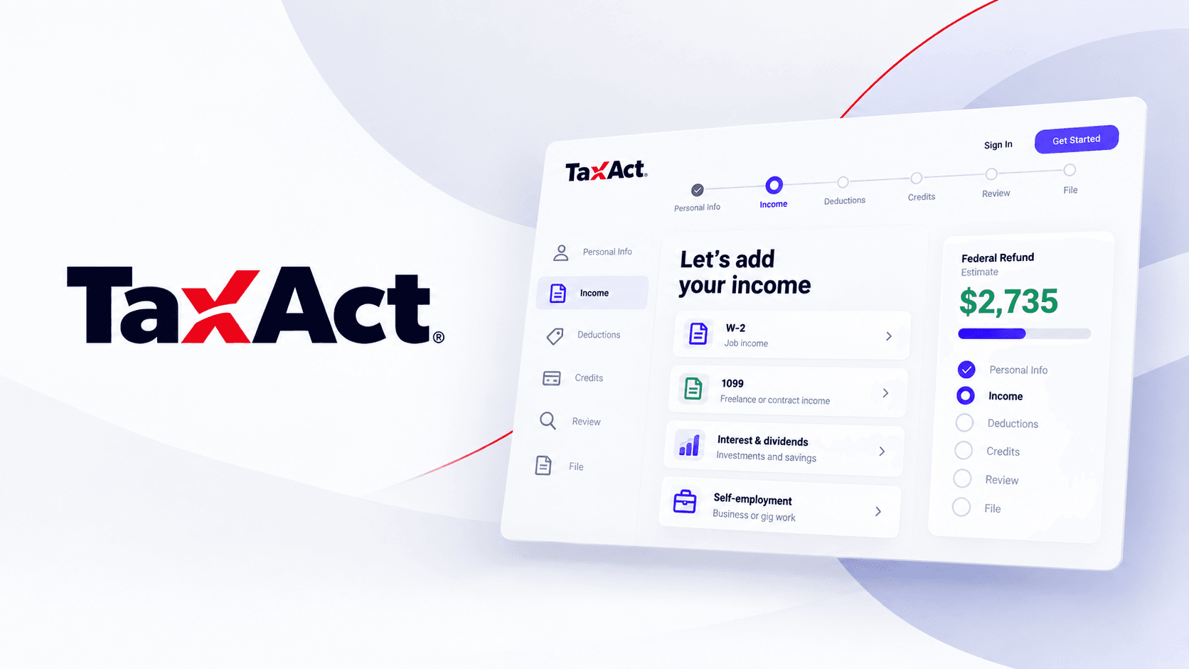
Project Overview
TL;DR: TaxAct had refreshed its brand, but the product underneath still looked and behaved the way it always had. The brief was to bring the core filing flow up to date. Research changed the answer. Watching 11 real filers file their own returns showed that the biggest problem was not how the product looked. People got stuck, and when they did, they wanted a person. None of the three products we studied offered one. So we redesigned the Federal Tax Return flow around a live human tax assistant who steps in when a filer hesitates, and built it on research instead of a visual refresh.
Role: Senior UX Designer at projekt202, on the TaxAct account. I worked in a four-person design team with two experience researchers, a creative director, and a program manager, embedded with TaxAct's product owner and engineers. My focus was research and synthesis, and the redesign of the Federal Tax Return flow.
The Challenge & Context
TaxAct had recently redesigned its brand, but the interface running underneath it had not moved. The Federal Tax Return flow is the one experience every filer goes through, and it had been built up over years, one screen at a time. Headings, buttons, and form patterns looked and behaved differently depending on which part of the product you were in.
The brand refresh gave TaxAct a reason to look again. But a new coat of paint would not have fixed what filers were actually running into: locked-out logins, W2 imports that failed without saying so, data they had to type in again that the software already had, and upsells that showed up when they were anxious about what they owed.
Left alone, the product would have looked new and still lost people at the same moments. And every competitor offered the same thing, a solo form with a Help article, so TaxAct would have had nothing to set it apart. Before changing a single screen, we went and found out what was really wrong.
The Process & Decision-Making
Watching people file, in their own homes
Rather than run a survey, the team went to filers directly: 11 participants across Dallas and Seattle, spanning their 20s to their 60s and a wide income range, split evenly by gender. Each session was in-context: people were watched filing for real, on their own machines, with their own documents.
To understand how TaxAct actually compared, observation didn't stop at TaxAct. The same filers were watched using TurboTax and H&R Block too, so every pain point logged had a competitive baseline attached to it.
Turning 1,200+ notes into eleven themes
Every observation, quote, and behavior became its own data point, over 1,200 in total, run through affinity diagramming: raw notes grouped into "I" statements, then "we" statements, then up into named themes the whole team could work from.
It's a slow climb from a wall of sticky notes to something a product team can act on, but skipping it is how research turns into a report nobody reads twice.
One theme changed the direction of the whole project
Most of the eleven themes pointed at things the team expected: filers wanted convenience, clarity, plain language. Theme eight was different. Filers kept saying, unprompted, that when they got stuck, what they actually wanted was a person, not another Help article.
None of the three products studied offered that. This was before AI assistants were a realistic option, so the theme became the seed of a very specific bet later in the project: a live tax assistant, staffed by an actual human, that could step in the moment a filer hesitated.
Three filers, three very different relationships with confidence
Personas were built straight from the eleven participants, rated across five spectra: financial understanding, confidence, initiative, how often they sought help, and tech skill. Three distinct patterns emerged, from a filer who avoids taxes out of anxiety to one who wants the software to predict her needs before she asks.
Mapping where trust actually broke down
A simple filer's full path (Prepare & Login, Basic Info, Federal, Review & File) was traced, pinning every pain point to the exact step it happened on. Login and password-reset friction. W2 imports that failed silently. Manual entry filers resented. A marketing upsell that landed right when someone was anxious about what they owed.
Plotting emotion alongside each step made the pattern hard to miss: confidence rose and fell in a predictable rhythm, and every dip lined up with a moment the product offered no help at all.
Turning findings into a standard the team could design against
The last step of the research phase was making sure it didn't stay a report. The eleven themes were distilled into ten design principles, language the whole team, design and engineering both, could hold every later decision against.
They included Use Concise Language, Be Clear, Humanize the Experience, Carry the Load, Anticipate My Needs, and Comfort in the UI.
The Solution & Final Design
Built around the moments where trust broke
The redesigned Federal Tax Return flow targets the exact friction points the research surfaced. It was validated with a subset of real filers before it shipped.
Questions, not forms
The old flow handed filers a wall of forms and expected them to know what applied. The redesign asks one plain question at a time. Each screen has a short progress marker, a clear answer to pick, and the same place to go next. It follows the principles of concise language and carrying the load for the filer.
A person, right when you hesitate
This is the idea the whole project turned on. When a filer pauses on a question, the flow does not wait for them to hunt for help. A small prompt steps in, offers a quick explanation, and puts a live expert one tap away, with an honest wait time. They can also dismiss it and come back later. Help stops being a place you have to go find and becomes something that notices you.
This was before AI assistants were a realistic option, so the assistant is a real person, staffed by TaxAct. The research was clear that a person was what people wanted.
A return tailored to you
Filers should not wade through topics that do not apply to them. The flow uses what it already knows to skip what is not relevant and recommend what is, and it explains why. It also saves what a filer has already told it, so they are not asked twice.
Bringing data in so filers do not retype it
Manual entry was one of the things filers resented most. The import screens give people more than one way in: connect a brokerage, upload a file, or carry over last year's return, with the fastest option marked.
Reassurance as you go
The flow shows where the filer stands as they move through it. The deductions screen compares the standard deduction against itemizing and recommends the better one. The summary closes with the estimated refund, how it compares to last year, and what helped.
A lightweight system underneath
The redesign sits on a shared library of components, built foundations first, so new screens stopped being improvised one at a time. It was designed in Sketch, built in React by TaxAct's developers, and new components went through a UX designer and a UI architect before release. It supported the work, but it was never the point. The point was the flow.
Impact, Outcomes & Learnings
What the work did achieve is easier to point to. The redesign addressed the specific moments where filers lost trust: login friction, failed W2 imports, and mistimed upsells. It replaced screen-by-screen improvisation with one consistent flow that design and engineering could both build from. And the proactive assistant offered a form of live human help that none of the three products in the research, including TaxAct's own earlier version, had.
Reflection: This project sharpened the case against treating a brand refresh as permission to repaint the product. The research kept turning up a structural gap, people wanting a real person when they got stuck, that no amount of visual polish would have fixed. Looking at competitors early was a check on that instinct too. TurboTax and H&R Block had landed on the same generic, solo filing pattern, so solving the problem meant moving away from the category, not matching it with a nicer look.