a
Project Overview
TL;DR: MarketChorus is a content intelligence company. It uses machine learning to look at digital content through the lens of social media: what is getting attention, who is giving it, and what they care about next. I was the lead product designer on the product, called Resonance, a tool that starts with one article and opens up everything around it. Paste a link and you see how it is performing, who is engaging with it, which related stories are worth a look, and which topics are rising. You can then set an alert and come back when something moves.
Role: Lead Product Designer, Focus: the end-to-end product experience, from first search to saved alert, and the way it makes machine learning output readable.
The Challenge & Context
The people who use MarketChorus are creators, PR teams, researchers, and sales teams. They all ask versions of the same question: what is worth writing about, and who will care? The answer lives in social media, spread across platforms and buried in raw numbers.
The product's machine learning could already find that signal. The hard part was showing it. A list of articles with share counts does not tell you why something is catching on, who is behind it, or whether it is still climbing.
The data was there. People needed a way to discover it.
The Process & Decision-Making
Start with one article
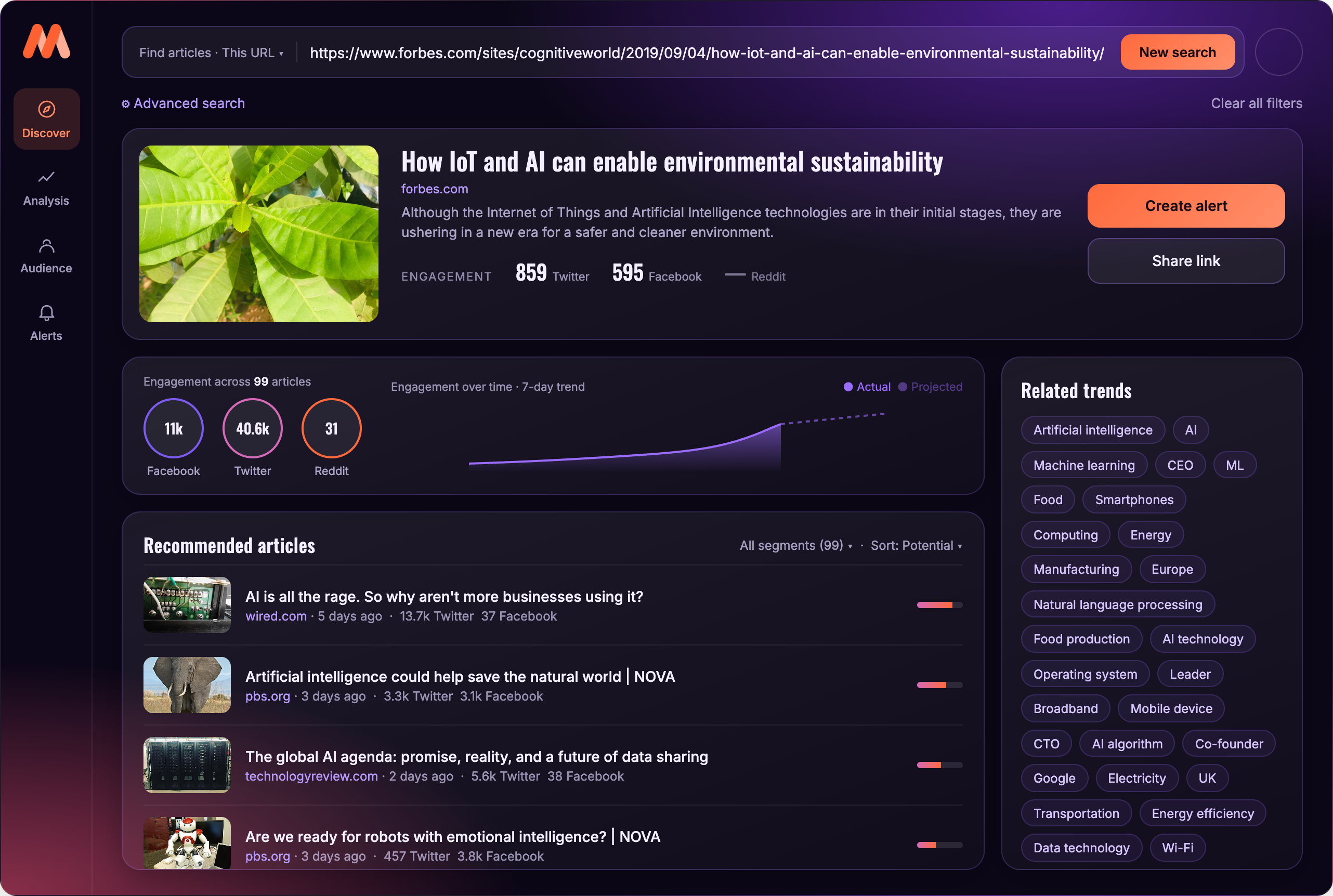
The product begins with a link. Paste an article and the whole screen reorients around it. That one choice gives every number a point of comparison, because everything below the search is measured against the story you started with.
Show the trend, and where it is heading
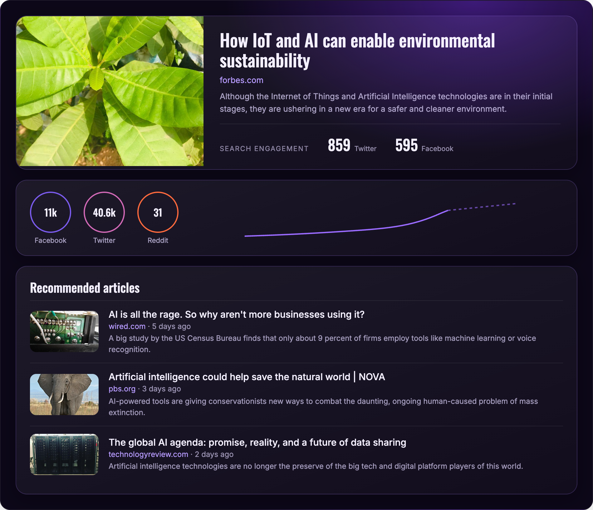
Engagement totals are easy to show and hard to use. A story with 10,000 shares could be at its peak or just getting started. So each article carries a seven-day trend, with a dashed line that projects where it goes next. Solid means what happened. Dashed means what the model expects. People can tell the two apart without reading a legend.
Make audience a first-class view
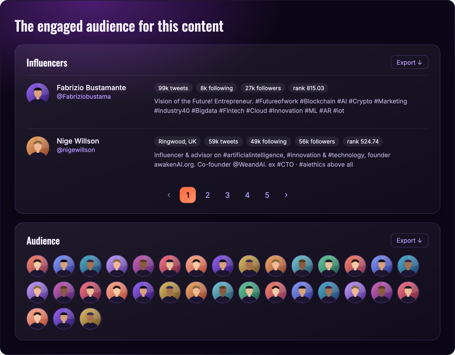
Knowing an article is popular is useful. Knowing who is behind that attention is what lets a team act on it. The audience view gives the same weight to influencers, the accounts with the biggest reach on the topic, and the wider audience engaging with it. Each influencer shows followers, activity, a short bio, and a rank, with a clear way to export the list.
Turn model output into something visual
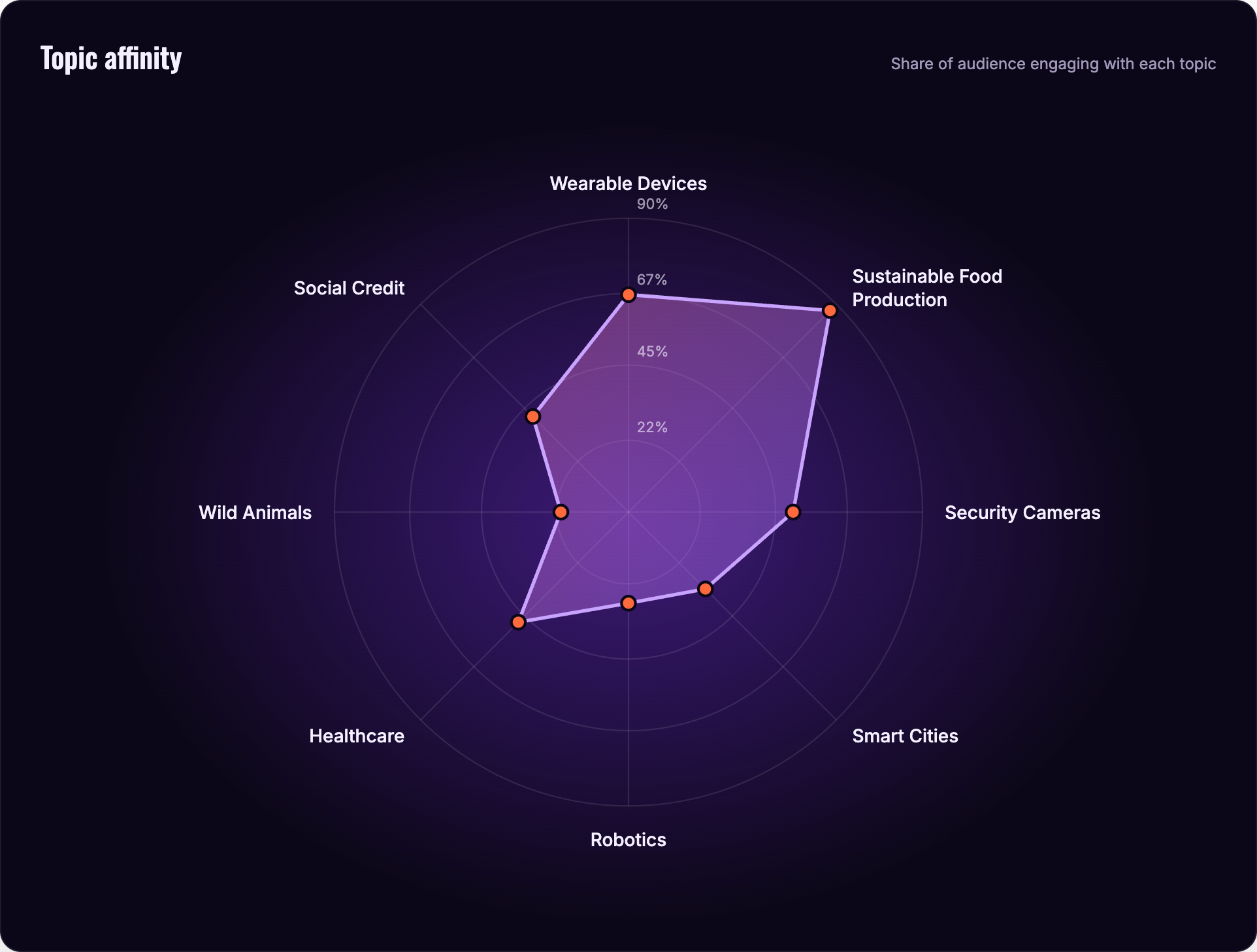
Topic affinity is the kind of result that is easy to bury in a table. A radar chart shows, at a glance, which topics an audience engages with most and where they overlap.
The Solution & Final Design
From discovery to a saved alert
Discover is the home of the product. A search bar sits at the top, with the article you searched in a card below it, its engagement by platform, its trend, a list of recommended articles ranked by potential, and a column of related topics. Each part answers a question a researcher would ask next, and each one leads somewhere: another article, a topic, the audience behind it.
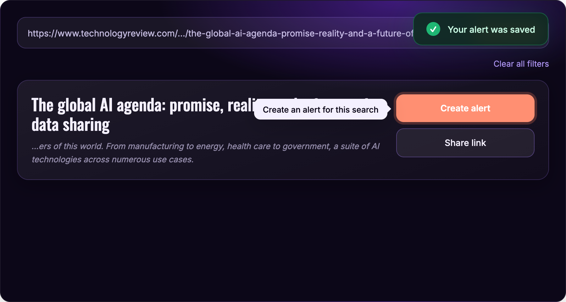
When something is worth following, the primary action is one click away. Create alert watches the search and tells you when it changes, so the work does not depend on remembering to come back. A confirmation appears right where the action happened, and a tooltip on the button says exactly what it will do.
A system under the screens
The platform colors, the engagement rings, the trend line, and the topic chips follow one visual language across every view.
Impact, Outcomes & Learnings
Working on a product built on machine learning taught me that the interface decides whether the intelligence gets used. The model could find the signal on its own. Design had to answer the questions that came right after it: why, who, and what next. Putting one article at the center, marking what is fact and what is forecast, and giving influencers and audience equal weight were the choices that made the output feel like something a person could act on.